


.avif)


Recognitions
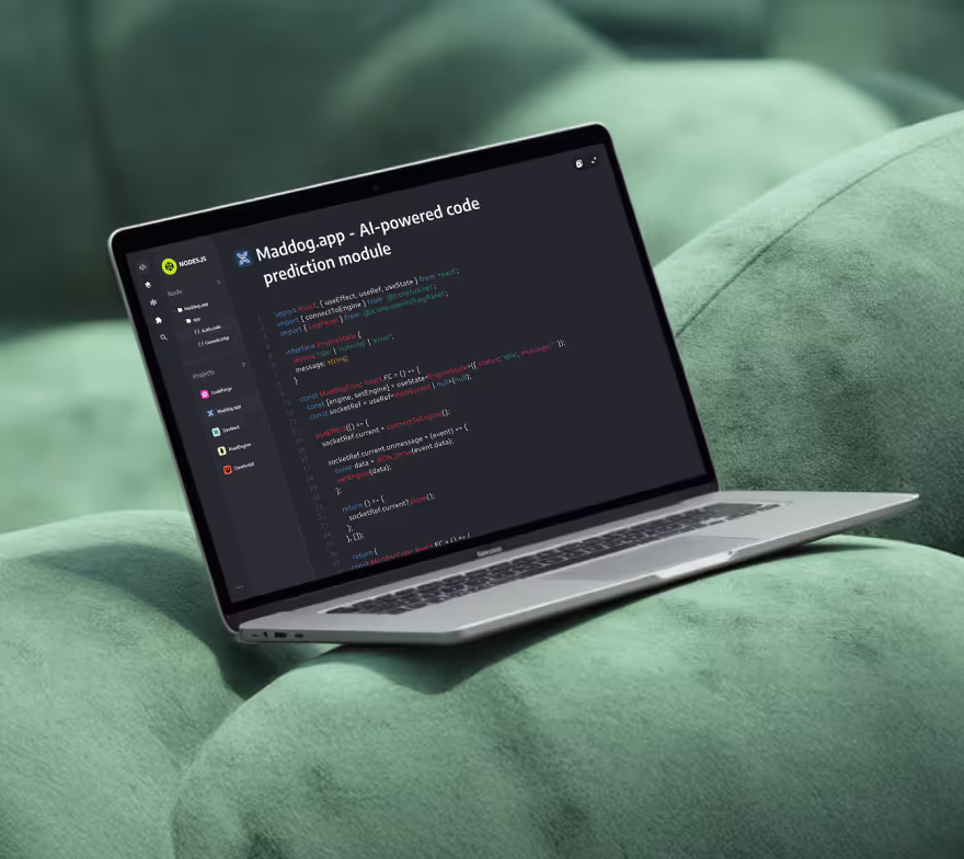
projects
Services


Your Website Is Your Pitch Deck: Building Investor Trust Online


It happens before you even open the Zoom. An investor hears your name, taps it into their phone, and lands on your website while the last meeting is wrapping up. You’ve got about a minute—on a small screen, on spotty Wi-Fi—to prove three things: you know exactly what you do, it works for real people, and you’re the kind of team that ships. In 2025, your site isn’t a brochure. It’s the live version of your pitch deck: tighter, faster, and judged in real time. Get it right and you start your call in the green. Get it wrong and you’re spending half the meeting trying to recover the trust you just lost. This post is a founder-first guide to turning your website into an investor-ready pitch—without adding months to your roadmap.
The investor’s 60-second skim
Picture the scroll from the other side of the table. They land on your homepage and look for one line that tells them who you serve, what outcome you deliver, and how you do it. They glance at the next block for signals—logos they recognise, a metric that isn’t hand-wavy, a human quote with a name and title. They want to see the product, not a mood board; a couple of screens with a sentence of context will do. They’re asking “why now?”—is there regulation, behaviour, or cost pressure that makes this urgent? And, yes, they peek at the team: faces, roles, a hint of relevant wins.
If you’ve made the next step painfully obvious—Book demo, Start trial, Get pricing—they’ll click it. If not, they’ll assume your funnel is as fuzzy as your story and bounce.
Translate your deck into a website people can use
Think of the site as the deck’s greatest hits, edited for how people actually read.
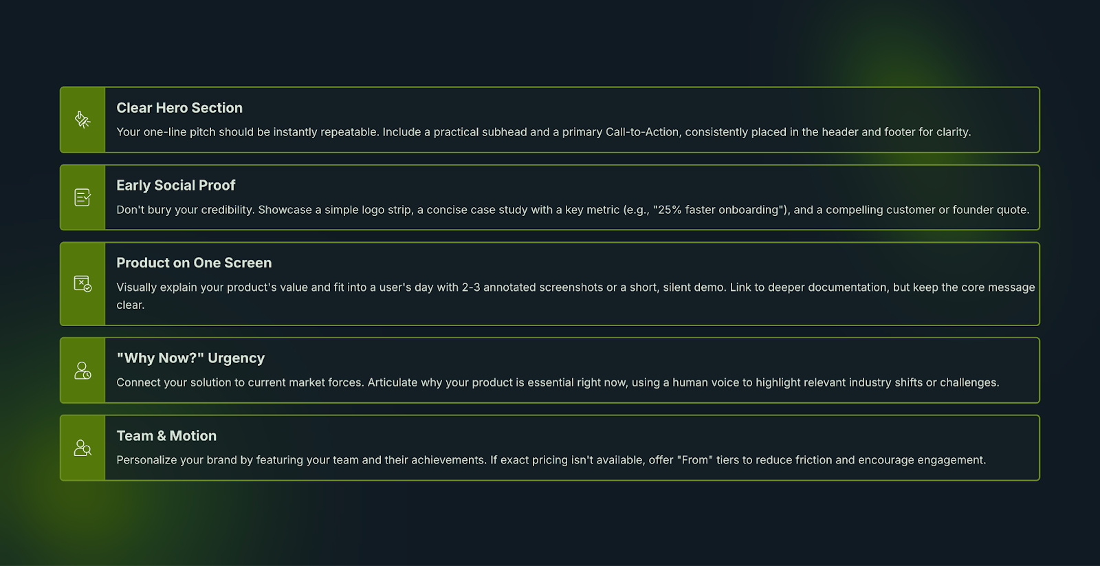
Hero = your one-line pitch. Write it so a stranger can repeat it after one glance. Keep the subhead practical. Put a single primary CTA right next to it and repeat that same action in the header and footer. Clarity beats clever every time.
Proof early, not buried. Signals work best up front. A simple logo strip, one short case snapshot with a number (“cut onboarding time 25%”), and a founder or customer quote with a name/title. The trio of logos + metric + human builds more confidence than a wall of badges.
Product in one screen. Two or three annotated screenshots, or a 30–45s silent demo. Show what it does and how it fits into the buyer’s day. Link deeper docs from here; don’t cram the homepage.
Why now. One paragraph, human voice. “Compliance just changed.” “Human review doesn’t scale.” “Cloud costs turned a nice-to-have into a must-fix.” Tie your product to a current push/pull.
Team and motion. Faces matter; so does focus. Show who’s building, what they’ve done, and how to talk to you. If you can’t publish exact pricing, “From” tiers reduce friction without boxing you in.
Don’t have big logos yet? You still have traction
Investors aren’t allergic to early. They’re allergic to vague. If your customer list is still forming, show the shape of traction in other ways: the number of active pilots, the quality of your waitlist, time-to-value in days, unit improvements from a beta. “Eight pilots across three verticals” and “first insights in 14 days” beat ten paragraphs of vision. Small, specific numbers build trust faster than big, fuzzy claims.
Design decisions that quietly shout “we’re the team”
The details on your site are proxies for how you’ll run a roadmap.
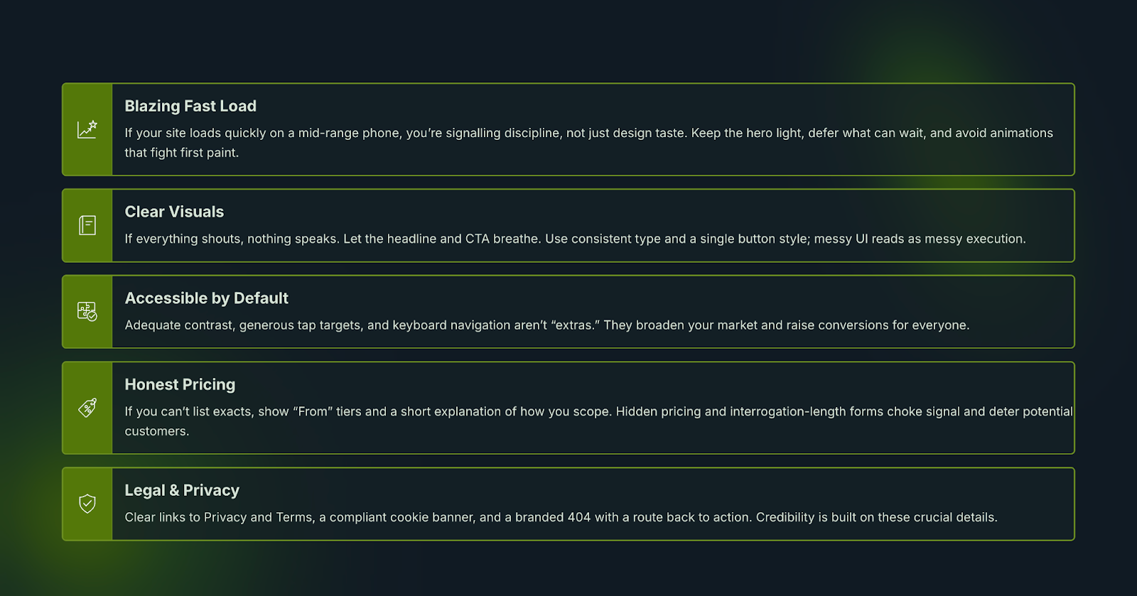
- Speed on mobile. If your site loads quickly on a mid-range phone, you’re signalling discipline, not just design taste. Keep the hero light, defer what can wait, and avoid animations that fight first paint.
- Hierarchy and whitespace. If everything shouts, nothing speaks. Let the headline and CTA breathe. Use consistent type and a single button style; messy UI reads as messy execution.
- Accessibility as default. Adequate contrast, generous tap targets, and keyboard nav aren’t “extras.” They broaden your market and raise conversions.
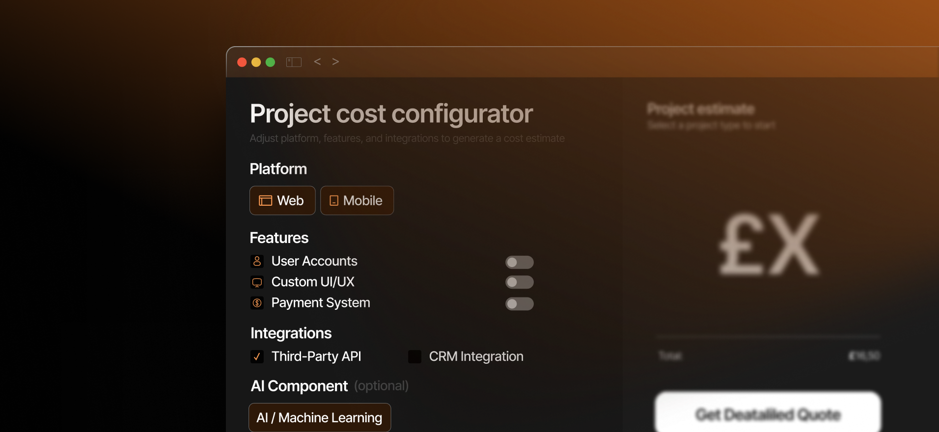
- Pricing honesty. If you can’t list exacts, show “From” tiers and a short explanation of how you scope. Hidden pricing and interrogation-length forms choke signal.
- Legal and privacy. Clear links to Privacy and Terms, a compliant cookie banner, a branded 404 with a route back to action. Credibility is details.
A founder story (you might recognise yourself)
Maya has a small, sharp team and a product that finally clicks. Her deck tells a crisp story; her site still tells the 2023 one. Before a round of investor meetings, she makes three changes: rewrites the hero to a single, repeatable line; replaces “platform of the future” fluff with one case snapshot and a human quote; swaps a nine-item nav for five, with a single CTA everywhere.
She ships in Webflow to avoid dev queues and gives marketing the editor keys. The site loads fast on phones, looks like the product, and makes booking a demo effortless. When investors open it between meetings, they see the same story the deck tells—only faster. Calls start with curiosity, not clarification. That’s the job.
Why Webflow is the right surface for this job
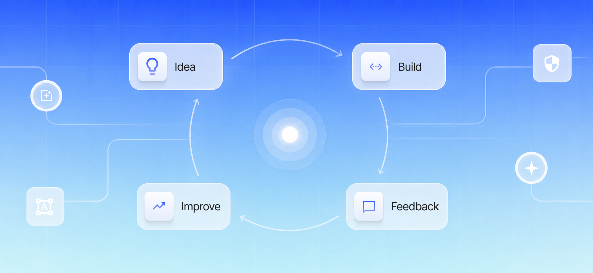
You don’t need a heavyweight engineering lift to get investor-ready. You need to move quickly without painting yourself into a corner. Webflow lets design and development ship together, gives non-technical teammates a safe editor for real-time updates, and runs on reliable hosting without plugin roulette. It’s the rare choice that speeds you up before and after launch.
If you want the shortest path from plan to live, our Startup Launch Pack bundles strategy, UX/UI, and Webflow development into one sprint. We plan the story, design for conversion, build the system, and hand you the keys so your team can keep moving. Launch Faster. Launch Right.
A realistic two-week trust sprint (if you’re pitching soon)
Week one is words and pictures; week two is system and ship.
Days 1–3: Write the one-line promise and pick a single CTA. Outline the lean page set (Home, Product/Service, Proof, Pricing, About, Contact). Gather screens, logos, and two real numbers you’re proud of.
Days 4–6: Design the hero, proof block, product overview and team section with mobile in mind. Use numbers where adjectives used to be. Keep it clean.
Days 7–10: Build in Webflow: components for nav, footer, cards, pricing, testimonials and forms; CMS for cases (blog later); responsive states; friendly success/fail messages. Wire GA4 and your ad pixel to track leads and bookings.
Days 11–14: Compress media, set Open Graph images/titles, test on real phones, publish. Watch sessions and trim friction. You’re not aiming for perfect; you’re aiming for confident.
The takeaway
Investors want to see a team that knows what it does, has proof it works, and makes decisions quickly. Your website can communicate all three before anyone hits “Join meeting.” Write the promise in a line. Put proof where eyes land. Make the next step obvious. Keep the page fast.
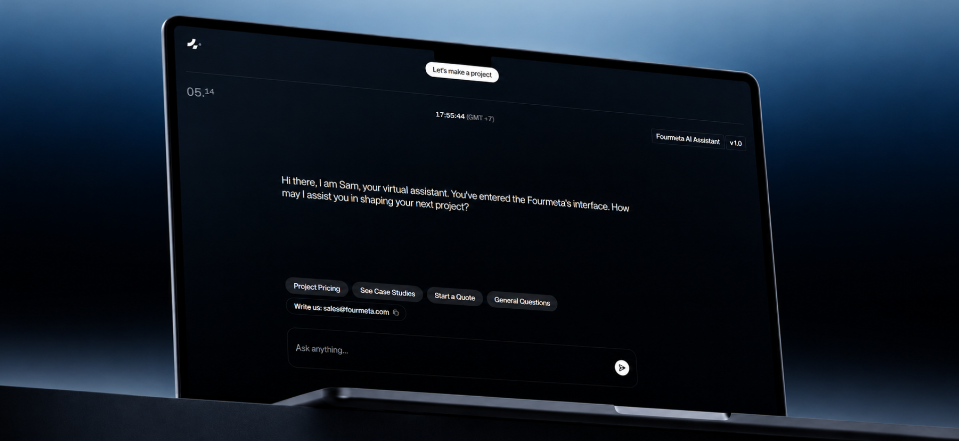
If your calendar says ship, act like it. We’re Fourmeta—an Official Webflow Partner with hundreds of launches behind us. We build beautiful, fast, conversion-ready sites and hand you the keys so your team can iterate without bottlenecks.
Next step: Launch Faster. Launch Right — book a free 30-minute strategy call and we’ll map your shortest path to an investor-ready site.


.avif)


Subscribe for insights, service updates, and a closer look at the world of Fourmeta®
Get a solution and price estimate