


.avif)


Recognitions
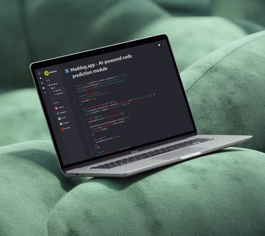
projects
Services


From Idea to Live in Weeks: The 2025 Webflow Launch Playbook for Startups


There’s a familiar scene in startup land. The product finally clicks. Your deck is crisp. Investors are taking second meetings. And your website… still looks like “early days.” You don’t need six months of redesign theater. You need a credible, conversion-ready site live this month—one that books demos, starts trials, and makes you look like the team to bet on. The good news: in 2025, “idea to live” in 2–6 weeks is absolutely doable. The trick isn’t heroics; it’s focus. Scope the smallest site that can win, build where your team can move (hello, Webflow), and decide quickly. This post is the playbook founders use when they’re done waiting.
Why speed matters more in 2025 than it did last year
Attention is shorter, sales cycles are lumpier, and AI has turned “generic content” into background noise. What still cuts through is clarity + proof delivered fast. The startups that win ship a site that says exactly what they do, shows who believes them, and makes the next step painfully obvious. Then they iterate weekly.
That’s why Webflow has become the default for lean teams: design and development move together, marketing can publish without tickets, and you skip the plugin/patch merry-go-round.
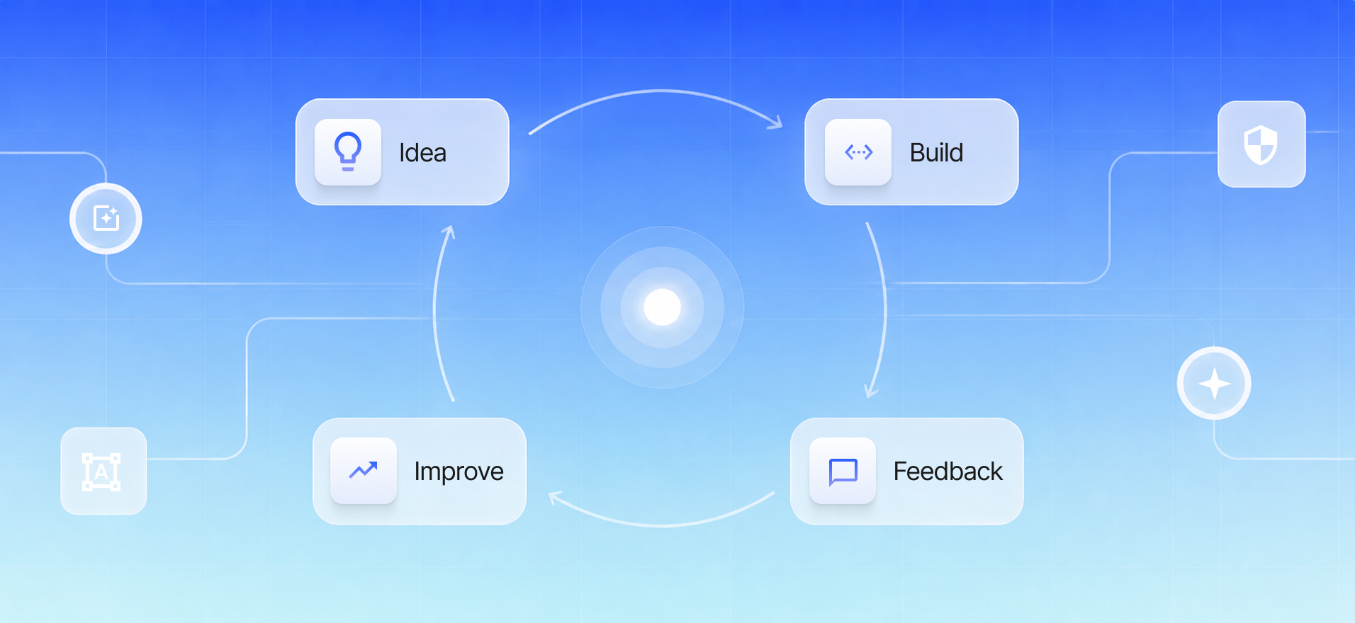
What actually makes a 2–6 week launch possible
Two things, mostly:
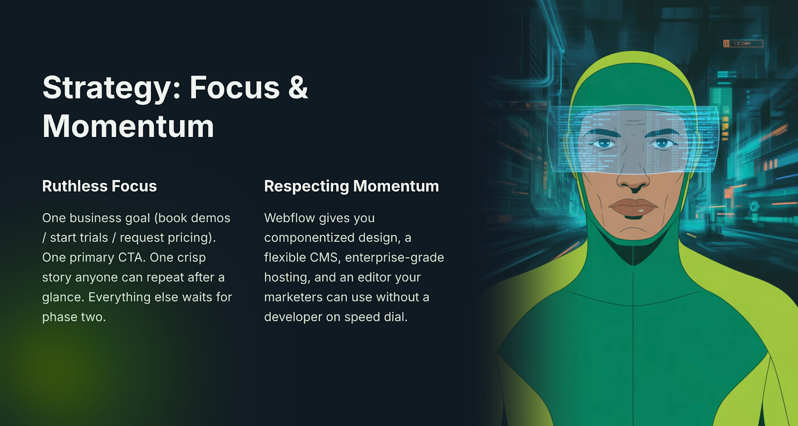
- Ruthless focus. One business goal (book demos / start trials / request pricing). One primary CTA. One crisp story anyone can repeat after a glance. Everything else waits for phase two.
- A build system that respects momentum. Webflow gives you componentized design, a flexible CMS, enterprise-grade hosting, and an editor your marketers can use without a developer on speed dial.
If you want the shortest, least painful path, our “Startup Launch Pack” bundles strategy, UX/UI, and Webflow build into one sprint. You can read how we run it here: Launch Faster. Launch Right.
The playbook (told as a four-week story)
Week 1 — Decide like a founder.
You pick the hill you’re going to take. “Book 40 demos this month” is a better brief than “improve the site.” You write a one-line value prop, agree a lean sitemap (Home, Product/Service, Pricing, Proof, About, Contact), and gather real assets—logos, screenshots, a couple of measurable results. The team knows the goal and the deadline.
Week 2 — Design for outcomes, not dribbble.
Wireframes turn into high-fidelity layouts. Above the fold you state the promise in plain language and give one obvious action. Proof shows up early (logos, a short founder quote, one clean metric). Pricing sets expectations with “from” tiers. On mobile, nothing fights the CTA. The work looks premium, but it reads even better.
Week 3 — Build where you can move.
In Webflow, the system comes together: global styles, components (nav, footer, CTAs, cards, pricing), CMS collections for cases/blog/FAQs, and responsive breakpoints that actually get tested. Forms return friendly success/fail states. GA4 and the Meta Pixel are wired to track the moments that matter (lead submitted, call scheduled, pricing viewed).
Week 4 — Ship and sharpen.
You load production copy, run a messy QA on real phones, set redirects, preview social cards, and publish. Then you watch: heatmaps, recordings, conversion events. In the first 72 hours you fix spacing, tighten the headline, nudge a button contrast, and remove anything clever that isn’t pulling its weight. You’re not polishing—you’re making it easier to say “yes.”
The parts most teams overthink (and what to do instead)
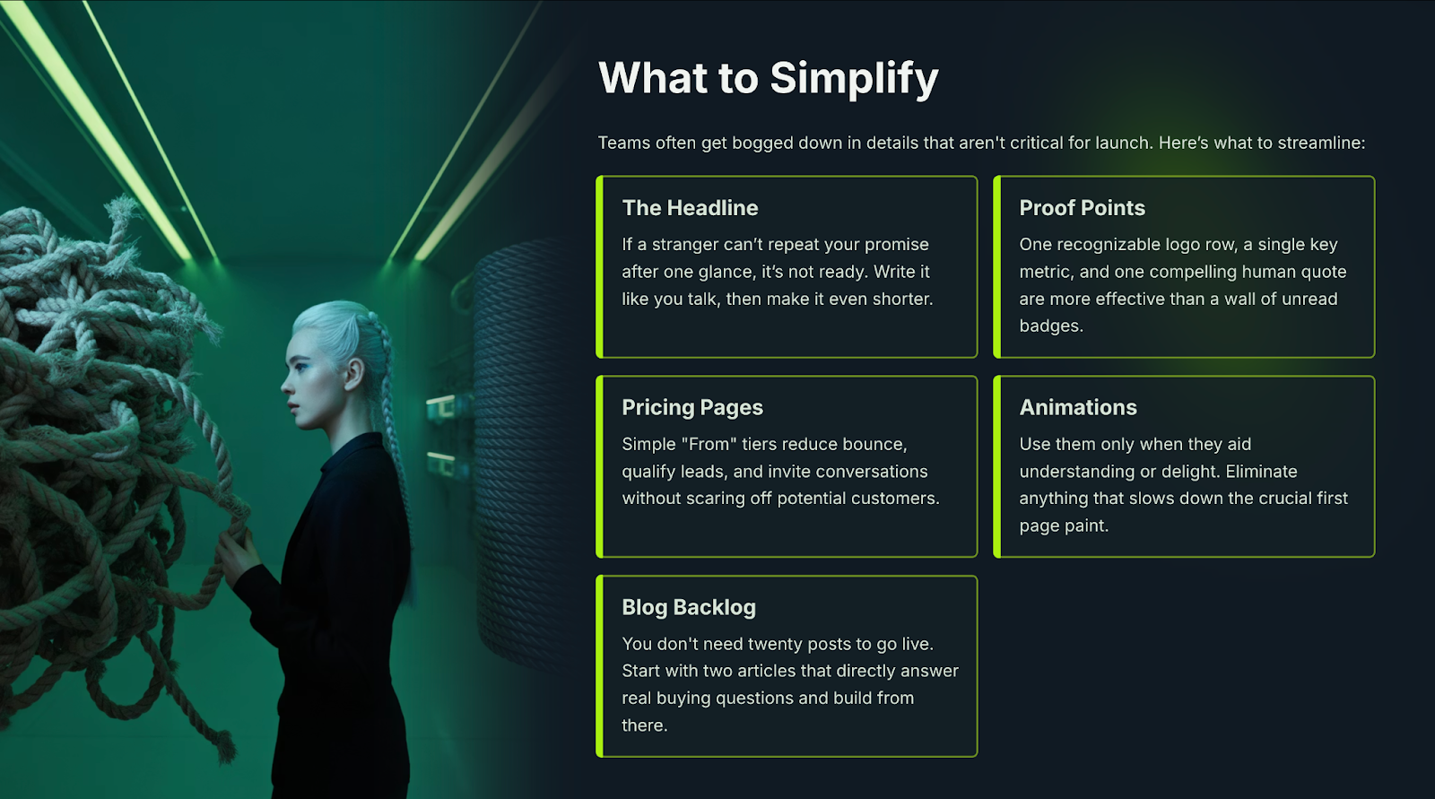
- The headline. If a stranger can’t repeat your promise after one glance, it’s not ready. Write it like you talk. Then shorter.
- Proof. One recognizable logo row + one short metric + one human quote beats a wall of badges nobody reads.
- Pricing. “From” tiers reduce bounce and qualify without scaring off conversations.
- Animations. Use them where they help understanding or delight. Kill anything that slows the first paint.
- Blog backlog. You don’t need twenty posts to go live. Publish two that answer real buying questions and build from there.
Why Webflow is the right call for lean teams
You could ship this on a dozen platforms. The reason Webflow keeps winning founders is that it removes friction after launch as well as before it. Marketing can change copy and publish new pages without a dev. The CMS is structured, not bolted on. Hosting is fast and boring (the good kind). And when you’re ready for phase two—richer templates, gated content, more integrations—the foundation holds.
What “good enough” looks like on day one
A headline your buyer can repeat. One CTA that shows up in the header, hero, mid-page, and footer. Proof near the top and next to the form. A short form and a way to book a call instantly. A site that feels snappy on a mid-range phone.
Ship that, and you’re not “early.” You’re live—and learning.
Ready to stop waiting on the website?
If your calendar says “ship,” act like it. We’re Fourmeta—an Official Webflow Partner with hundreds of launches behind us. We plan, design, and build beautiful, fast, conversion-ready sites, then hand you the keys so your team can iterate without bottlenecks.
Next step: Launch Faster. Launch Right — grab a free 30-minute strategy call and we’ll map your shortest path from idea to live.


.avif)


Subscribe for insights, service updates, and a closer look at the world of Fourmeta®
Get a solution and price estimate