


.avif)


Recognitions
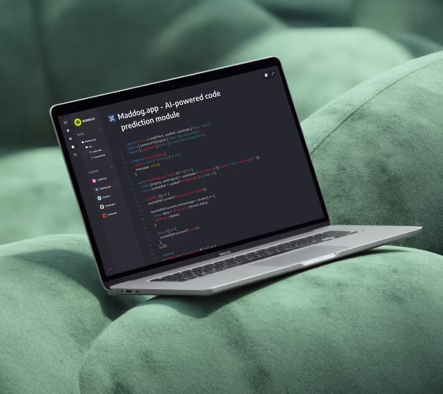
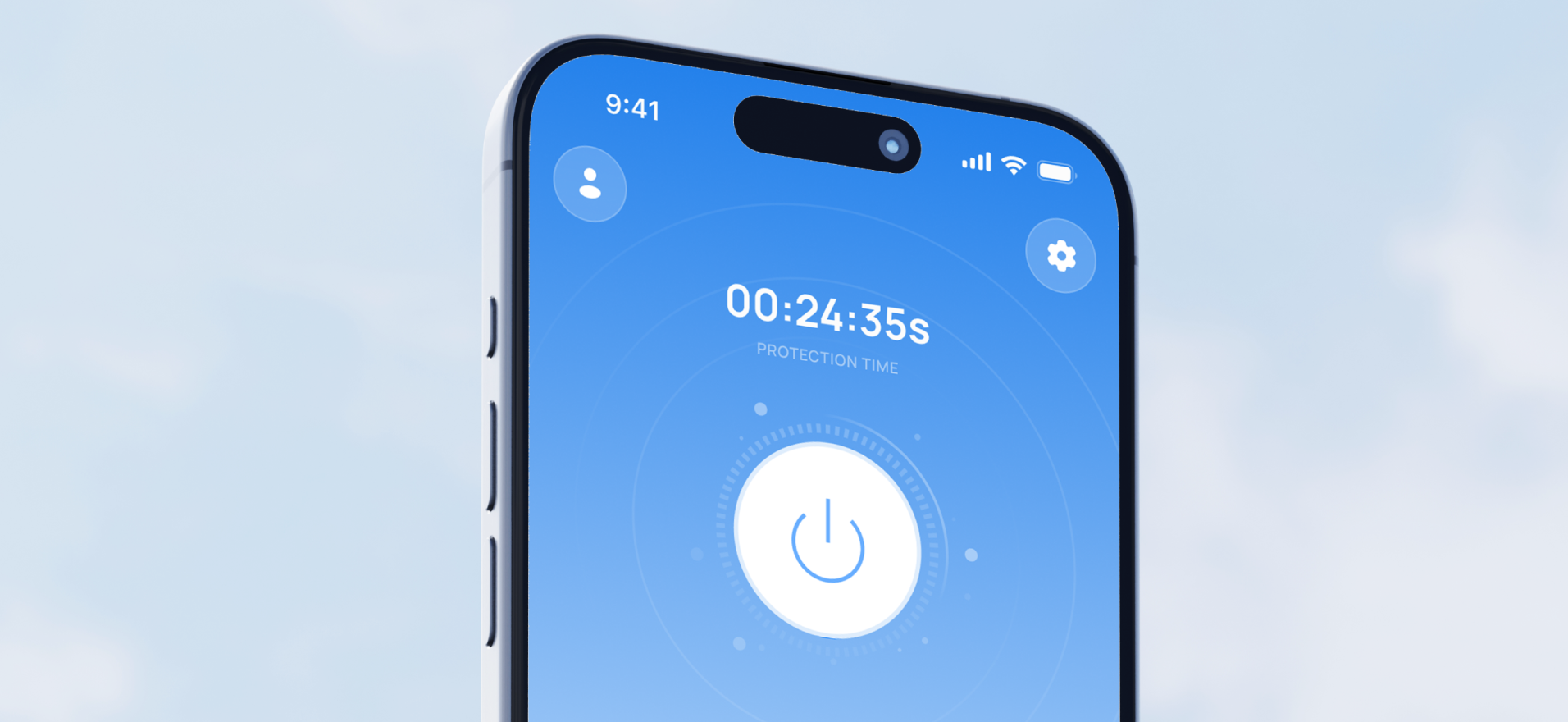
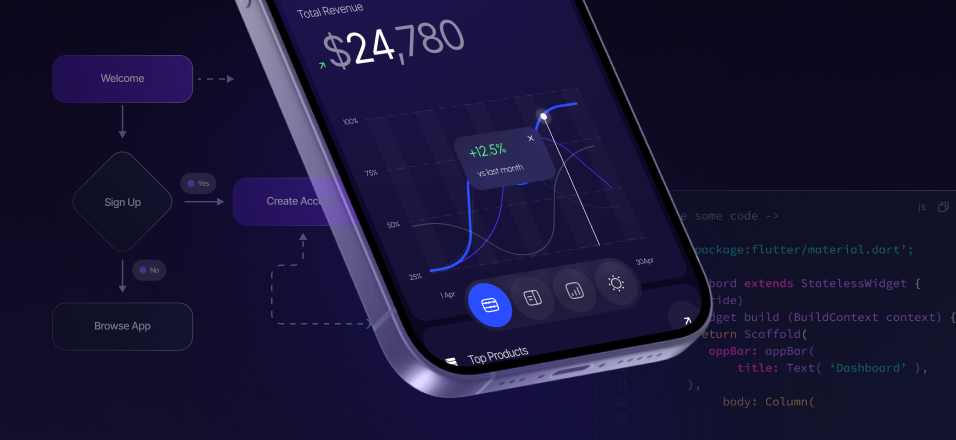
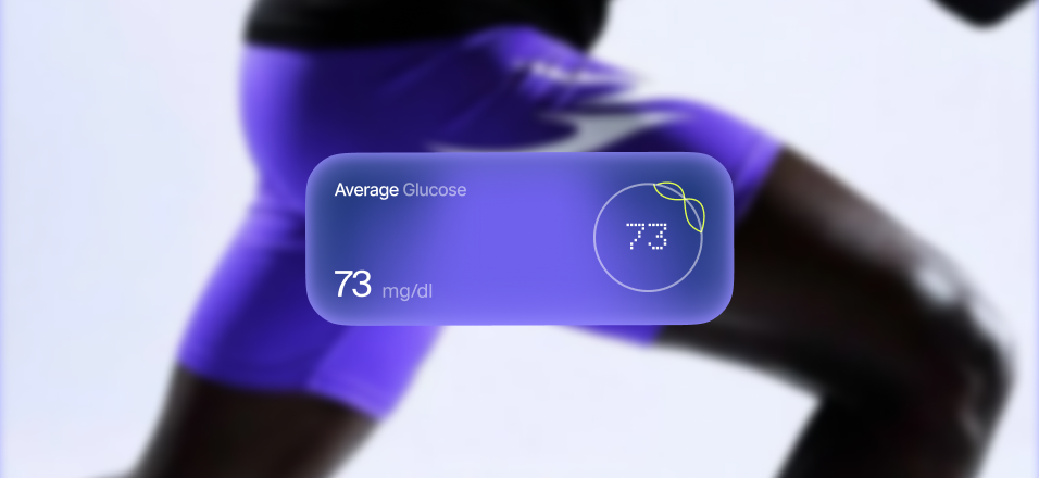
projects
Services


7 Website Mistakes That Scare Off Investors (and How to Fix Them Fast)

If you’ve got investor meetings on the calendar, your website is part of the pitch—whether you plan on showing it or not. VCs will Google you on the train, open your site on a phone, and decide in seconds if you’re a team that ships or a team that… talks. The bar in 2025 isn’t perfection; it’s clarity, speed, and proof. Below are the seven website mistakes that quietly kill confidence—and how to fix each one fast (yes, in a week, especially if you’re on Webflow). (If you want the shortcut, our Startup Launch Pack bundles strategy, UX/UI, and Webflow build into one sprint. Launch Faster. Launch Right.)
1) A murky value prop above the fold
Investors don’t have time to decode clever copy. If a stranger can’t repeat what you do after one glance, that vagueness gets mapped to everything else—go-to-market, roadmap, even hiring.
Fix it fast: Write one sentence that names who it’s for, what outcome they get, and how you deliver it. Make that your H1. Put one primary CTA next to it (Book a demo / Start trial). Save the poetry for your Series B party.
2) Looks good on desktop, breaks on a phone
Most diligence is mobile. A cramped hero, tiny tap targets, or a form that scrolls off-screen tells an investor you optimize for Dribbble, not revenue.
Fix it fast: Review your top pages at 360–414px widths. Increase tap targets (≥44px), trim the hero copy, stack content cleanly, and make the CTA impossible to miss. If it reads well on a phone, it will sing on desktop.
3) Speed drag
Nothing says “expensive growth” like a slow site. If your first paint lags, investors assume your funnels leak and your CAC is higher than it should be.
Fix it fast: Compress images (WebP/AVIF), lazy-load everything below the fold, keep the hero under ~250KB, and kill heavy animations that don’t earn their keep. Aim for LCP < 2.5s and CLS < 0.1 on mobile. It’s not glamorous, but neither is wasted ad spend.
4) Proof that isn’t… proof
Endless adjectives without evidence read like hand-waving. Investors want to see who believes you and what happened when they did.
Fix it fast: Add a recognizable logo row, one short case snapshot with a number (“+32% sign-ups in 90 days”), and a human quote with name and title. That trio—logos, metric, testimonial—does more for credibility than ten badges.
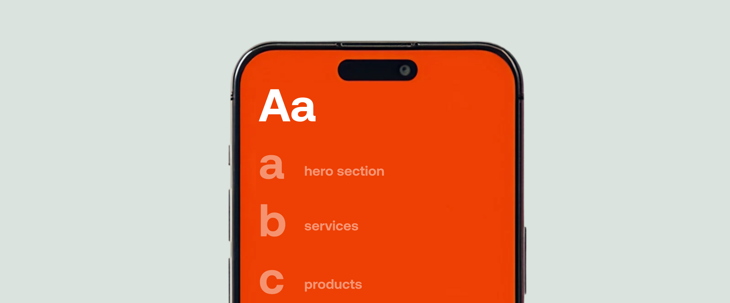
5) Too many paths, no obvious next step
A nav with nine items, three CTAs in the hero, and dead-end sections tell investors your site wasn’t designed to convert—so your funnel probably isn’t either.
Fix it fast: Choose one primary action and repeat it: header, hero, mid-page, footer. Reduce the nav to the essentials (Home, Product/Features, Pricing, Case Studies, About). Link deeper details from the product page; don’t clutter the hero.
6) Pricing and contact friction
Hidden pricing and long forms smell like fear. They also choke signal: fewer conversations, less data, slower learning.
Fix it fast: If you can’t list full pricing, use “from” tiers to set expectations. Keep the hero form to Name + Work Email (add company/URL if you must). Embed Calendly next to it for instant bookings. Let speed be your first impression.
7) Foundations missing: SEO, trust, and basics
Investors notice the seams: no privacy page, broken 404, identical titles across pages, images without alt text. Sloppy foundations hint at sloppy execution elsewhere.
Fix it fast: Give every page a unique title (≤60 chars) and meta description (≤160). One H1 per page. Descriptive alts for images. Clean, human URLs (/pricing, /case/askflow). Publish Privacy/Terms, show your company info in the footer, and add a compliant cookie banner. Ship a branded 404 with a CTA back to “Book a demo.”
A one-week investor-readiness sprint
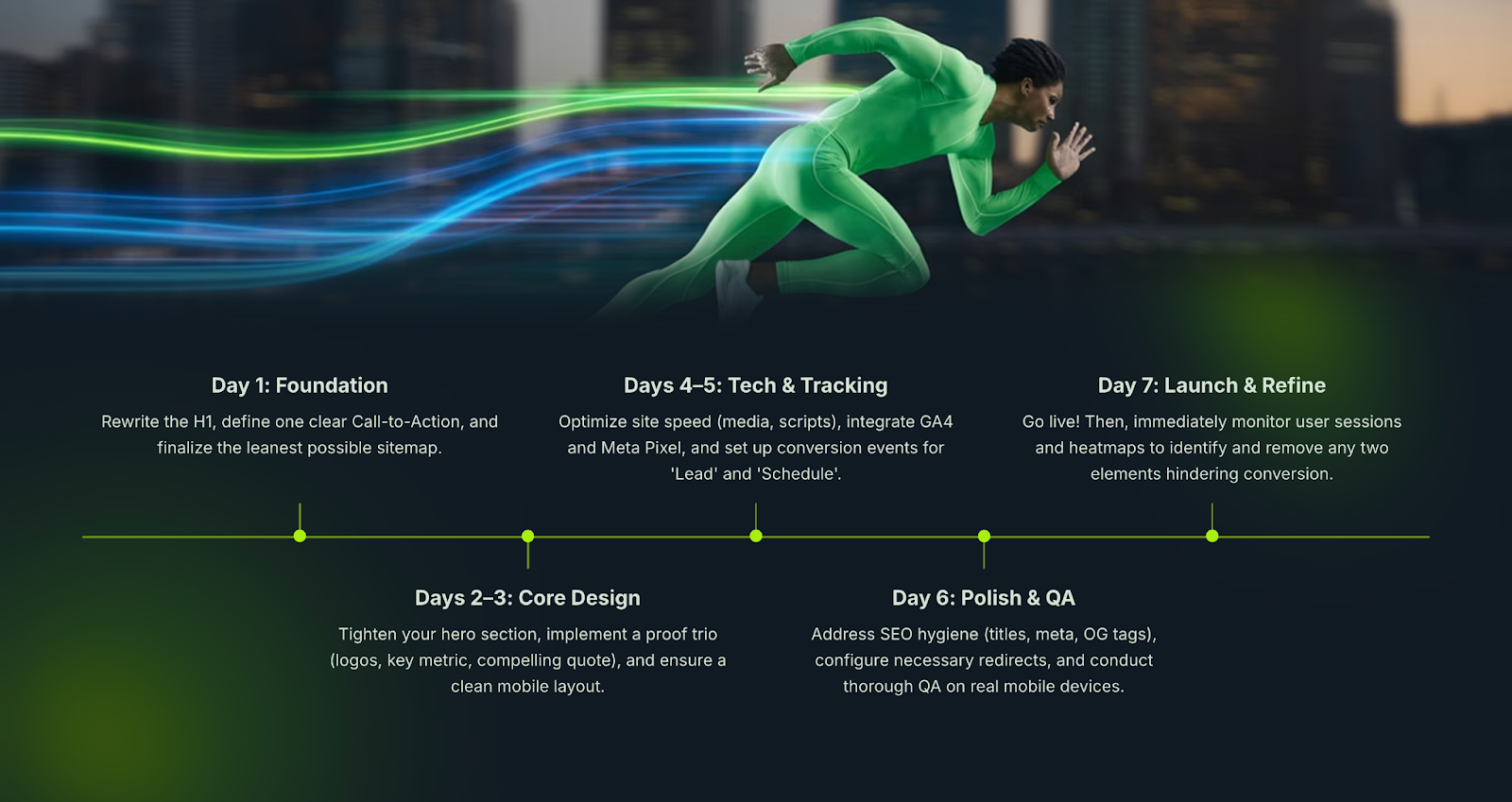
Day 1: Rewrite the H1, pick one CTA, agree the lean sitemap.
Days 2–3: Tighten hero, add proof trio (logos + metric + quote), clean mobile layout.
Days 4–5: Fix speed (media + scripts), wire GA4 + Meta Pixel, add events for Lead and Schedule.
Day 6: SEO hygiene (titles/meta/OG), set redirects, QA on real phones.
Day 7: Publish, watch sessions/heatmaps, and remove two things that don’t help conversion.
The investor lens, simplified
They’re asking three things as they scroll:
- Do you know exactly what you do and for whom?
- Is there evidence it works?
- How quickly can I see this team make good decisions?
Your website can answer all three in under a minute. Make that minute count.
If you want a partner who can plan, design, and ship this quickly, we’re Fourmeta—an Official Webflow Partner with hundreds of launches behind us. We build beautiful, fast, conversion-ready sites your team can edit without dev bottlenecks.
Next step: Launch Faster. Launch Right — grab a free 30-minute strategy call and we’ll map your shortest path to “investor-ready.”


.avif)


Subscribe for insights, service updates, and a closer look at the world of Fourmeta®
Get a solution and price estimate