


.avif)


Recognitions
projects
Services


11 Key UX and UI Components Driving Website Engagement


In this blog post, you will discover eleven proven elements that can assist in creating engaging UI designs, enhancing functionality, aesthetic appeal, and overall performance.
User engagement lies at the heart of every successful digital endeavour. UI/UX design serves as the gateway to user interaction, playing a crucial role in shaping how individuals perceive and interact with websites. It significantly influences the user experience, driving meaningful interactions and impacting decisions to explore further, stay engaged, or leave a website.
To enable users to navigate websites effortlessly, find desired information, and enjoy a positive experience, more than just having a good idea and quality content is required. It necessitates a thorough understanding of fundamental web design principles to ensure visual appeal and easy accessibility, thereby enhancing engagement levels throughout the design and development processes.
In this blog post, you will discover eleven proven elements that can assist in creating engaging UI designs, enhancing functionality, aesthetic appeal, and overall performance.
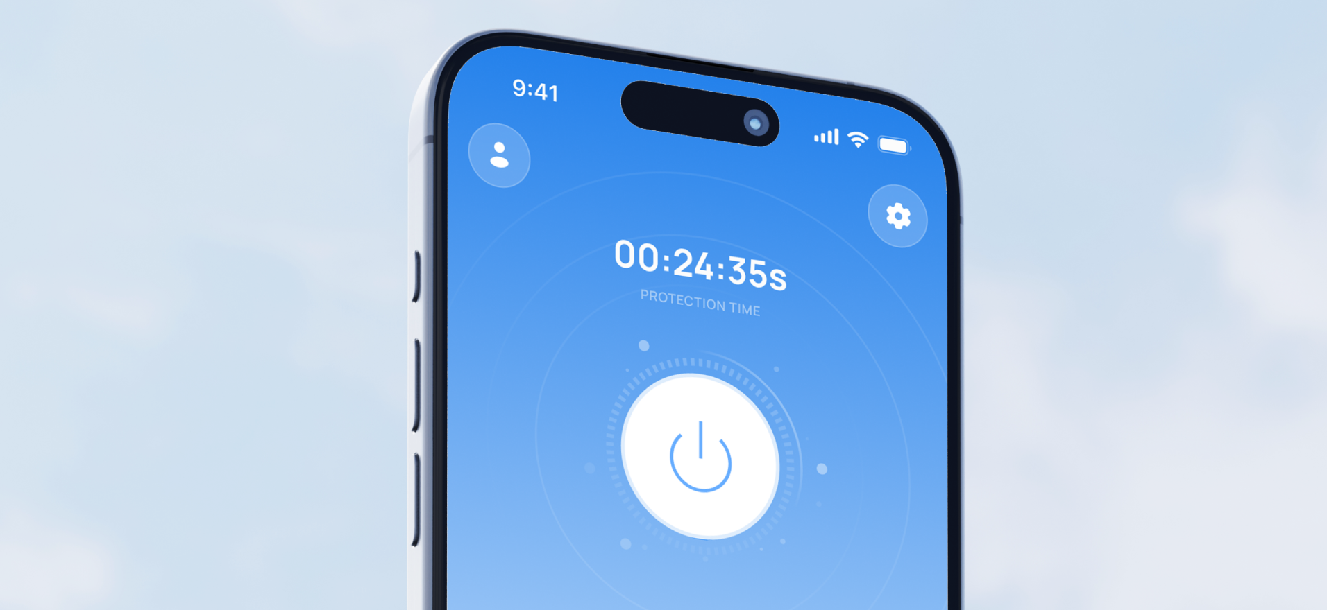
Navigation. A Clear Path to Engagement

Navigation exerts significant influence over user engagement. Without clear navigation, especially on multi-page websites, visitors may feel stranded on the initial landing page, unable to explore further as if navigating a maze without a map.
A structured navigation system with a clear hierarchy of information provides users with the "map" of the website, with navigation menus typically presented in two formats: horizontal bars or vertical sidebars.
Engaging websites often adopt a pyramid navigational structure, starting with broad categories and gradually narrowing down to specific subtopics. This approach facilitates logical progression and aids in content discovery, empowering users to explore various facets of the website and enhancing their browsing experience.
Innovative techniques such as context-aware navigation further enhance the user experience. By leveraging user data to personalise navigation, websites can customise the browsing experience according to individual preferences and behaviours, anticipate user needs and foster deeper engagement.
Prioritising clear and intuitive navigation is crucial for encouraging exploration and ensuring users keep returning.
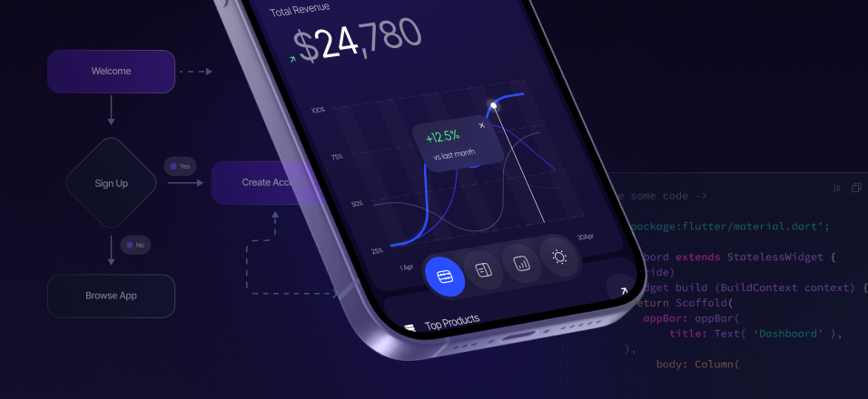
Layout. Structuring Website Engagement

A well-crafted, clean, and organised layout is crucial for guiding users through digital content, helping them grasp the structure of the content and enhancing visual appeal, thus increasing engagement.
A homepage layout should be intuitive and visually appealing, instantly capturing the attention of users as soon as they arrive on your site. Website builders such as WordPress or Weebly provide a range of pre-designed templates to jumpstart the design process, or you can explore other websites for inspiration.
On one hand, as highlighted by Jacob’s Law, users are drawn to sites that resemble familiar models. By leveraging existing mental models and adhering to familiar design patterns and conventions, such as the typical placement of expected elements like 'Search' and the 'Shopping Cart', websites can reduce cognitive load and streamline the user experience, allowing visitors to focus on their objectives.
On the other hand, while consistency in layout across pages is often valued, variation can inject freshness and vitality into the user experience. Updating layouts for different navigation folders provides a tailored experience for each section of your website. Diverse layouts inject dynamism into the browsing journey, preventing monotony and encouraging exploration.
Additionally, essential information, such as contact details, should be easily accessible to users, whether integrated into an 'About' page or prominently displayed in the footer, and consistent across various platforms. This establishes credibility, reduces user frustration, and enhances customer engagement.
Typography. Enhancing the User Interface
Typography plays a significant role in shaping user perception and interaction, extending beyond mere aesthetics to include readability and adaptability. Selecting readable, visually pleasing fonts that align with the visual style and atmosphere of your website and brand identity helps convey tone, personality, and intent.
Sans-serif fonts like Arial or Roboto are commonly preferred for digital content due to their clean readability, while serif fonts like Times New Roman add elegance to titles and headers, enhancing visual contrast and sophistication. To maintain visual coherence, it is advisable to limit font variations to a select few – usually two or three.
Font size is also crucial, with a 16-point font size serving as the baseline for body text to ensure optimal readability across devices, especially on mobile platforms. Captions and labels may vary slightly in size, while headers command attention with proportionate enlargement - maintaining a balanced hierarchy between headings and body text is essential.
Fonts must appear consistent across various devices, seamlessly adapting to different screen sizes. Since font size changes depending on the font style, adjustments in font sizes and line spacing may be required to ensure legibility on smaller displays. However, there are web-safe fonts like Arial or Helvetica that ensure consistency across browsers and devices.
Furthermore, typography also involves the spacing between letters. Line length and spacing are critical in enhancing readability, with the ideal line length typically falling between 50-60 characters. Adequate line spacing, known as leading, further enhances readability by allowing the eyes to move smoothly across the digital page.
By establishing hierarchy and emphasis, typography effectively guides users through the digital landscape, enhancing their engagement and browsing experience.
Colour Scheme. Painting the Canvas of Engagement

Thoughtful consideration of your webpage's colour palette is essential for crafting an engaging user experience. Colours have the power to evoke emotions, imbuing websites with mood, personality, and visual appeal, thus shaping user perceptions and influencing their interaction with your site and your brand as a whole.
It is crucial for your website's colour scheme to align with your brand essence and resonate with your target audience. Drawing inspiration from your logo's hues and tones can help establish your website's visual identity. Whether opting for a monochromatic palette or complementary contrasts, the colour scheme should effectively communicate your brand ethos and personality.
The process of selecting colours also involves considering functionality and coherence. A minimalist interface with restrained colours exudes sophistication and clarity, while clashing colours can detract from engagement. Striving for simplicity and cohesion means adhering to a limited colour palette – ideally two to three colours, with the third serving as an accent to highlight important elements and focal points. It is important to find a balance, informed by user research and the 60-30-10 rule, which suggests allocating 60% to a dominant colour, 30% to a secondary colour, and 10% to an accent colour to achieve visual harmony and coherence.
Images and Icons. The Visual Vanguard of Engagement
When users first visit a website, they often encounter a visually striking logo or captivating imagery that embodies the essence of the business, brand, or the website's purpose. While not obligatory, imagery and well-designed graphics immediately draw attention to key information, products, or services, sparking curiosity and conveying meaning in ways that words alone cannot.
Images evoke emotions and memories, as they possess a universal symbolism that transcends cultural and language barriers. Each image serves a specific purpose in shaping user perceptions and driving engagement, fostering a sense of connection with the brand or website.
Icons, on the other hand, serve as visual cues to aid users in navigating menus, indicating actions, or highlighting features. By utilising icons, websites can streamline the user experience, making interaction intuitive and effortless.
When used effectively, these visual elements have the power to transform a mundane website into a captivating digital experience, fostering deeper engagement with the brand or content.
Buttons and CTAs. Guiding Users Towards Action

Buttons and calls to action (CTAs) are crucial components of any effective user interface. Despite their apparent simplicity, these elements wield significant influence over user behaviour and conversion rates, guiding users toward desired actions within interfaces.
Typically, websites feature primary CTAs for core actions and secondary CTAs for supplementary actions. Limiting the number of button styles to a maximum of three helps maintain clarity and coherence in design, prevent user confusion and enhance the overall user experience.
Buttons prompt users to sign up, make a purchase, or explore further. Their strategic placement and visual prominence are vital for capturing user attention and encouraging action. Crafting CTAs requires clarity and transparency in both text and appearance – clear, engaging, actionable text combined with prominent placement ensures that a button's purpose is clearly communicated and users are more likely to take the desired action.
Hence, it is crucial to customise each CTA on a page according to the specific audience segment within the sales funnel. The button should prominently contrast with the background, and the text on the button should concisely describe the action to be taken upon clicking. Steering clear of generic labels like 'Submit' and opting for descriptive, actionable text such as 'I want to subscribe to your newsletter' improves clarity and prompts action.
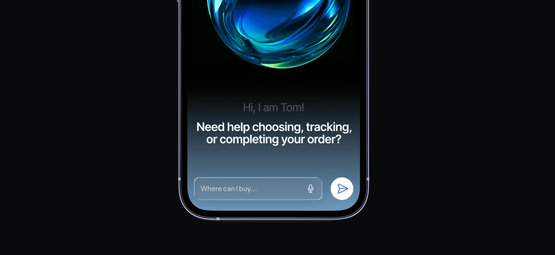
Forms. Streamlining User Interaction

Forms play a crucial role in gathering information, whether for sign-ups or purchases, and they can significantly impact user experience and engagement levels.
To encourage users’ participation, form titles should be clear, concise, and effectively communicate the purpose and value proposition to users. Thoughtfully chosen words must help users understand the specific service they are signing up for.
Forms should prioritise simplicity in layout and design, as well as clarity and efficiency. Well-designed forms are concise and straightforward, featuring clean layouts and clearly defined text fields. This approach reduces cognitive load and streamlines the information-gathering process.
Several key principles guide the design of user-friendly forms, including clear field labels indicating the required information, alphabetical sorting, and suggested answers in dropdown lists. Features such as autofill, autocorrect, and option selection from dropdown lists expedite completion, while tab navigation, error handling, and progress indicators further facilitate efficient completion. Presenting submitted information for final review and verification before submission ensures accuracy, while leveraging familiar labels and layouts saves time for both users and designers.
Loading Speed. Accelerating User Experience
Today's internet users have come to expect immediate access to information and smooth browsing experiences. Slow-loading web pages not only irritate users but also result in higher bounce rates as impatient visitors look for quicker alternatives. Conversely, fast-loading websites please users, prompting them to engage more deeply with content and enhancing overall satisfaction.
Optimising website speed requires a comprehensive approach, addressing both frontend and backend aspects. This involves strategies such as optimising images to reduce file sizes without sacrificing quality, streamlining code by removing unnecessary characters, comments, and whitespace, and adopting efficient coding practices to improve performance. Additionally, utilising browser caching and prioritising the loading of essential styles and scripts over less critical resources can further enhance load times.
Moreover, selecting a reputable web host with fast server response times, efficient data retrieval, and ample bandwidth is essential for effectively managing high volumes of traffic.
Furthermore, conducting usability tests with diagnostic tools like Google PageSpeed Insights and GTmetrix helps resolve issues that may hinder loading speed. Through thorough testing and diagnostics, areas for improvement can be identified, allowing for targeted optimisations to enhance the user experience.
Ultimately, fast-loading websites prioritise efficiency and user-centricity, meeting the demands of today's digital users.
Responsiveness. Navigating the Multidevice Landscape
The widespread use of mobile devices and tablets has pushed websites beyond traditional desktop boundaries. With users dedicating a significant portion of their internet time to mobile devices, the demand for mobile-friendly websites is higher than ever. Adopting a mobile-first philosophy has become essential for crafting responsive web experiences that resonate with modern audiences. Users now assess a site based on its mobile compatibility – research shows that users are 52% less likely to engage with a company if they encounter poor mobile design.
Mobile-responsive design ensures that all design elements adapt to varying screen sizes and capabilities, delivering consistent functionality and aesthetic appeal across devices, and significantly impacting user engagement. By prioritising the mobile experience in every design decision, a mobile-first philosophy guarantees optimal functionality and user experience. Furthermore, this approach future-proofs websites against evolving device landscapes, ensuring continued relevance and effectiveness on both current and future devices.
Responsive web design relies on two key techniques: media queries and flexible layouts. Media queries enable websites to apply customised styling rules based on device screen sizes, ensuring optimal presentation and functionality. Meanwhile, flexible layouts use relative units like percentages to dynamically adjust content, accommodating varying resolutions with ease.
Microinteractions. Elevating User Engagement
Microinteractions greatly enhance the interactive experience by adding subtle animations or changes triggered by a single action, such as pressing a button or hovering over an element. These small yet impactful elements provide visual cues, confirm user actions, and add a dynamic layer to websites, infusing them with vitality.
The integration of microinteractions goes beyond aesthetics, encompassing functional and psychological dimensions. Each microinteraction should serve a specific purpose, such as providing feedback or guiding users through a process. By mirroring real-world interactions, these subtle animations bridge the gap between the digital and physical realms, making digital experiences more familiar and natural. When implemented effectively, microinteractions empower users with a sense of control, improving engagement, retention, and conversion rates.
Overall, microinteractions play a significant role in elevating user engagement by enriching interactions with responsiveness and feedback, fostering a sense of connection and empowerment.
Whitespace. Balancing Clarity
Whitespace, also known as negative space, refers to the unmarked area between design elements. It is a fundamental yet often overlooked aspect that enhances interface clarity, elegance, and focus.
Proper utilisation of whitespace exemplifies the principle that sometimes, less is more, as reflected in key design principles applied to its usage. These principles include maintaining consistent spacing across the website, avoiding excessive empty space or cluttered layouts, using whitespace to prioritise important elements or enhance the prominence and readability of key sections, and ensuring seamless adaptation to various screen sizes and devices to maintain design integrity.
Properly spaced elements promote visual balance and convey elegance and sophistication, fostering a positive perception of the interface. However, beyond aesthetics, whitespace contributes to usability and user engagement. Strategic use of whitespace organises content and establishes a clear hierarchy, guiding user attention from one item to the next with clarity and precision.
By balancing and structuring website pages, whitespace significantly improves navigation and readability. Contrary to a cluttered website that can leave users lost in a flood of information, incorporating negative space around the edges or between elements creates contrast, reduces visual noise, and highlights essential elements while providing users with breathing room.
By allowing the eyes to rest and guiding users through content more orderly, whitespace facilitates seamless navigation and comprehension. Whitespace creates a visual rhythm that alleviates information overload, enabling users to digest content at their own pace and engage more deeply with the website.
Wrapping Up
As we explore the components that contribute to website engagement, it is clear that a harmonious balance of functionality and aesthetics is crucial for captivating audiences and nurturing meaningful interactions.
In the quest to craft compelling digital journeys, the expertise of top UI design companies and professional web design services becomes indispensable. For those aiming to enhance their online presence and maximise engagement, Fourmeta offers tailored UX/UI services to meet various needs and goals.
With a focus on improving user interface design, Fourmeta empowers businesses to create captivating digital experiences that resonate with visitors. If you are ready to start digital transformation, Fourmeta is here to be your trusted partner in crafting memorable user experiences that set you apart online.


.avif)


Subscribe for insights, service updates, and a closer look at the world of Fourmeta®
Get a solution and price estimate